We're happy to tell you that Modern House Notes is in this week's Talk of the Town column.
We'd be even happier if we could say it was the Talk of the Town column in The New Yorker magazine, but it's not -- it's the Talk of the Town column in the Bedford-Pound Ridge Record Review, our hometown paper.
Our friend Bonni Brodnick writes the column and was nice enough to include us this week. The Record Review is paper-only but Bonni puts the column on her blog, which is here.
Thanks, Bonni! - ta
Down the hatch


While appalling to imagine spending any more than 3 minutes down there for any other reason, we do keep our wine there as the conditions are favorable for our extremely modest collection. I was impressed and amused to see on Blue Ant Studio how those with, uh, more resources than we keep their vintages. (see Spiral Cellars.)
What I'd really love is to make the underworld of our house into a space where the emerging drummer in the family can bang away to his heart's content – but that would require a lot more than just a fancy hatch! – GF
Architectural style matchboxes


Designed by Happy Forsman & Bodenfors.
Needs a Modern design to round out the group, don't you think? – GF
Trompe l'oeil of your own design


Living Modern in Connecticut documentary
I follow tweets from Where We Live on Connecticut Public Radio, but missed this discussion by WWL moderator John Dankosky with Diane Smith about her half-hour documentary, Living Modern in Connecticut, which premiered on November 12 on Connecticut Public Television.
Luckily, if you're in Connecticut and can get CPTV, there is one last opportunity to see this presentation on Sunday, November 22 at 10:30pm.
I listened to the podcast of the Where We Live discussion which originally aired the same day documentary aired. Dankosky, Smith, and Jared Edwards, an architect and chairman of (CT) State Historic Preservation Board, as well as callers, talk with enthusiasm about lots of our old favorites in New Canaan and elsewhere. If you can't see this last airing, you can buy the DVD of the documentary, as well as read the press release, here. And here's a promo for the show. – GF
Nice House + Spectacular Site = Questionable Future?

Our visit to the Brown House, in Guilford, Connecticut, was fascinating.
The drive to the house, once we got off I-95, was beautiful, along a quiet road that opened up in several places to overlook a broad salt marsh.
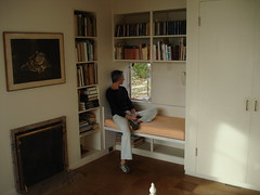
The house itself is nice – just what I like in a modern house: not too big, well-proportioned rooms, good connections between the rooms, a real indoor-outdoor feel, homey and probably comfortable (we loved the window seat in the master bedroom).

The site itself was spectacular. The house is situated on a rocky bluff facing southwest with a view of the bay, the Thimble Islands, and Long Island Sound beyond.

But these last two items are the problem, I think. The house is nice – nicer, in my opinion, than the Alice Ball House. But it’s not spectacular. The site is spectacular.
So for an asking price of $2.9 million, and for $47,000 a year in property taxes, you get a nice house and a spectacular lot. I think the temptation to do what the next door neighbor did – that is, buy a modern house on a similar site, tear it down and replace it with a monstrosity, this one in particular, which you can see from several of the bedrooms – will be too great to resist. I hope I’m wrong. --ta
The Tear-Down Risk
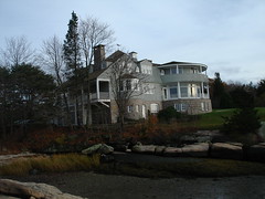
My gut reaction is that people exaggerate the risk that beautiful modern houses will be torn down. The Brown House in Guilford, Connecticut, for example, which I wrote about yesterday and which was designed in 1950 by E. Carleton Granbery. It's a beautiful house on a nice spot overlooking Long Island Sound and the Thimble Islands. Who would tear it down?
But it's not so far-fetched and my gut reaction is probably wrong. Anstress Farwell, the urban design aficionado from New Haven who knows the house and the neighborhood well, wrote to me yesterday with the news that right next door to the Brown house was another mid-century modern designed by Granbery. It's gone, she said, "demolished a few years ago by Tom Coville, an art dealer."
Farwell not only knows the neighborhood and the house but she knew the Browns. Here's what she wrote to me:
I lived there almost every year for twenty plus years - whenever Betty and Ralph took a trip. So I know it in all seasons and times. It's a wonderful place. She was exquisitely perceptive about light, and she framed views and choose colors to create a number of subtle atmospheres in the house. She always wanted the play of color outdoors to dominate. -- ta
The Modern House of a Leading Historic Preservationist

Elizabeth Mills Brown, who died about a year ago at age 91, was one of the original champions of historic preservation in Connecticut, and in New Haven in particular. She produced what a fan of hers describes as "one of the most important works of nonfiction ever written about any American city" -- New Haven: A Guide to Architecture and Urban Design. She served on Connecticut's review board for the National Register of Historic Places. She helped found the Connecticut Trust for Historic Preservation because of, among other things, "the new and vast scale of destruction unleashed when ... an ideology of modernism and walloping amounts of federal redevelopment funds combined to create the means and rationale for catastrophic urban renewal projects." And when the weekend came around and Betty Brown, as she was known, needed to get away from New Haven and the hard work of preserving the old, she retreated to what looks like a terrific little modern house on the shore of Long Island Sound, in Guilford.
I wrote that paragraph to make it sound like Betty Brown might have been an old-fashioned biddy more interested in preserving the ancient than in the modern. But that's a false irony. Anstress Farwell, another fan of hers, wrote:
Betty had a keen appreciation of modern and historic architecture. She worked to preserve the best of both.
And in this memorial essay, Farwell quoted Brown's reaction to a modern building in New Haven (one that I can't say I love):
"Yale University Art and Architecture Building, 1961, Paul Rudolph: This building has probably caused more furor than any other American architectural work of the mid-20th century. After the clear geometry of the Bauhaus era, these dynamic irregular masses, these many levels and recessions and brown textured surfaces came with the shock of a revolution. A storm center from the start - praised as the prophet of a new architecture, damned as wilfull and egocentric; dogged by misadventure; victim of arson, student vandalism, remodeling, and endless complaints - the A&A Building has had a bitter and embattled career. But despite the storm, what no one disputes is its magnificent presence. A gatepost building at the point where Chapel Street bends and leaves the old inner city, it transfigures a nondescript street and turns the lineup of the art buildings into a procession."
Brown was in her mid-30's when her house in Guilford was built. It was designed by a New Haven architect named E. Carleton Granbery:
Built in 1950 by architectural historian and Connecticut Trust for Historic Preservation founding member, Betty Brown, and her husband, this E. Carleton Granbery waterfront house celebrates the core principles of modern architecture: clean horizontal planes, generous use of glass and wood, open floor plan, and synergy of house and site.
That description was published in September by the Connecticut Trust for Historic Preservation, which goes on to say:
Desirability of the site makes demolition a very real threat.
The house is on the market for $2.9 million. Like all modern houses on beautiful lots, there's a chance it will be bought and torn down.
There are more photos here, including some black-and-whites that must have ben taken when the Browns lived there. The neighborhood apparently is something of a modernist enclave; this house, designed by Tony Smith, is there as well.
Raveis is holding an open house at the Brown house on Sunday, November 15, from 1 to 4 p.m. Depending on the zeitgeist and the weather, we're planning on checking it out. -- ta
A cozy little place for lofty ideas
 Of course I noted the opening of Google’s EMEA Engineering Hub in Zurich last year, and was even a little disappointed by the photos I saw that seemed like the same fun and games (literally) were included to help liberate employees' creative juices with outlets like game rooms and firemen's poles and slides to get from one floor the next lower. . .
The Modern City: Ugly Won't Cut It Anymore

I'd never heard of either the New York City Department of Design and Construction or Commissioner David Burney until I was flipping through the pages of New York Magazine the other night and was stoped by a photo spread showing five terrific-looking civic buildings. Burney, whose job is to approve the design of municipal buildings in the city, commissioned them all, and Justin Davidson, New York mag's architecture critic, says he's doing a great job:
For decades, the trinity of quick, cheap, and ugly dominated the city’s building program. Quick was always a chimera, and cheap remains sacrosanct, but ugly won’t cut it anymore. Agencies that once indifferently crammed schoolkids, cops, low-income residents, and garbage trucks into an assortment of interchangeable brick boxes now hire brand-name architects to infuse public buildings with panache....
One of Burney’s first acts as commissioner was to reject an anodyne design for a new firehouse in Bushwick that was trudging its way through the approvals process. Engine 277 and Ladder 112 deserved a home that was better than basic, he insisted, and he told the fire chiefs and the architects at STV to come up with something more distinctive. The happy result resembles a building-size fire truck with a rounded body and a windshield expanded to a curtain-wall façade.
Determined to get more for the public’s dollars, Burney put out the word that he values design and revamped the hiring process. Instead of giving jobs to the lowest bidder, he instituted a competitive process in which firms were short-listed on the basis of their achievements, then paired with a specific project later on. The latest list of preapproved firms includes Asymptote, Annabelle Selldorf, and Thomas Leeser—names whose cutting-edge luster might seem an odd fit for a senior center or police precinct. The recession has swelled the pool of available talent, DDC is energized, and officials who never expected to give much thought to architecture have become its patrons.
Here's a slide show that goes with the New York story. Davidson also singles out Polshek Partnership, which I hadn't heard of until yesterday, when I visited Sarah Lawrence College.
I haven't seen these buildings, of course, but what I like about the way Davidson characterizes them is that they all seem to work within the context of their neighborhood. They are not necessarily buildings that you'd go out of your way to see, but they are buildings that would elevate the experience of living in specific parts of the city.
I'm not a regular New York reader and I had never heard of Davidson before, but his short column is a model of popular architecture writing. -- ta
Visit the Heimbold at Sarah Lawrence

A colleague and I travelled today to Sarah Lawrence College, in Bronxville (or rather in the part of Yonkers that calls itself Bronxville), to check out a venue for a lecture series we're putting on at work, and found ourselves in the hip, lively, modern and LEED certified Heimbold Visual Art Center.
Direct sunlight angled through the windows, indirect light brightened the stairways and corridors, underground classrooms and studios were reserved for uses like darkrooms, there was plenty of bare concrete, steel, wood and cork on the floors and other surfaces, students were hanging a new show called Commercial Paper in the Barbara Walters Gallery, drawings and paintings and other student works were hanging all over -- in other words, it was a terrific sensory experience.
The building was designed by Polshek Partnership Architects and, although I wasn't taking notes, I'm pretty sure our tour guide said the firm's Susan Rodriguez headed up the project.
 The lecture, by the way, will be in the Heimbold building's theatre and will feature the executive director of Slow Food USA. It's set for Thursday evening, January 28. Sign up for it, or find another occasion to visit this terrific building. -- ta
Station Transformation


We were contacted several months ago by a woman in Sweden who likes to collect Mid-Century gas stations, and had found one she thought was designed by Eliot Noyes. She wanted to know if we could confirm her hunch. Apparently, others have a similar attraction to the functional, familiarly iconic, neglected structures. From The New York Times on-line column, "Great Homes and Destinations" comes this story with lots of photo.

Juerg Judin, an art dealer and collector, spent three years renovating this former mid-century gas station in the Schöneberg district in Berlin. Mr. Judin bought the station – unoccupied since 1986 – for 500,000 euros ($740,000) in 2005. Over the next three years, he restored the existing building, erected a new wing and created an idyllic outdoor garden.
 The gas station, designed in 1953, was built in 1956, and Mr. Judin, 47, claims he's never sat behind a steering wheel. He said, "I'm probably the only owner of a gas station who can't drive." – GF
(Thanks, Nancy!)
Photos: Andreas Meichsner for The New York Times
Pit stop


This public restroom, designed by Todd Saunders and Tommie Wilhelmsen, is just off the highway Aurlandsfjellet, or “snow road”, at Stegastein, in Western Norway. Windows in each unit frame a view of the Aurlandsfjord. So very handsome, it looks like a destination in and of itself. Although this project made the rounds in the architecture/design blogs quite some time ago, I rediscovered it in this little collection from Travel + Leisure magazine: World's Greatest Public Bathrooms. By the way, if you'll be traveling and want to be prepared for the inevitable (especially with children), here's an international site on where to sit, with reviews of each facility. – GF
More Modern Mailboxes


Swissmiss posted a link today to a Swiss creative agency with some dandy offerings. I wish they'd catch on here! Atelier 522 can be found here – lots of interesting things to see on their site. – GF
Thinking ahead: minimalist architecture to enjoy before and after (?) death


Go to +Mood to read more and see how a photograph by the future inhabitant was laser-engraved into the concrete – a stunning idea.
I couldn't find mention of what the photographer resides in while still among the quick, but I would bet it leans toward Modern. – GF
Gee, wonder why I keep going back to photos of this house . . .


Bonnard / Woeffray Architects in Switzerland. Of course. – GF
Subscribe to:
Posts (Atom)